Overview
The template wizard allows users to quickly and easily create customised and personalised letterhead and message templates for use within Explorer.
If you have any issues or any questions regarding the Template Wizard, Please contact the Medical-Objects Helpdesk on (07) 5456 6000.
Opening the Template Wizard
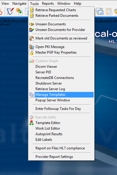
To open the template wizard, first go to the Tools menu on Explorer's main screen and then to Manage Templates. In the bottom left of the window, click the Wizard button.

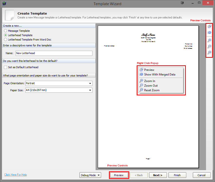
Here the user has three types of templates to create: Message Template, Letterhead Template and Letterhead Template From Word Doc. Each type has specific steps that need to be completed and the user can navigate between these steps using the navigation controls. Each step has a set of properties that the user can change in order to customise their template. The user can also preview their template by using the previewing tools available within the wizard. For more information regarding navigation, properties and previewing, please see below.
 Navigation
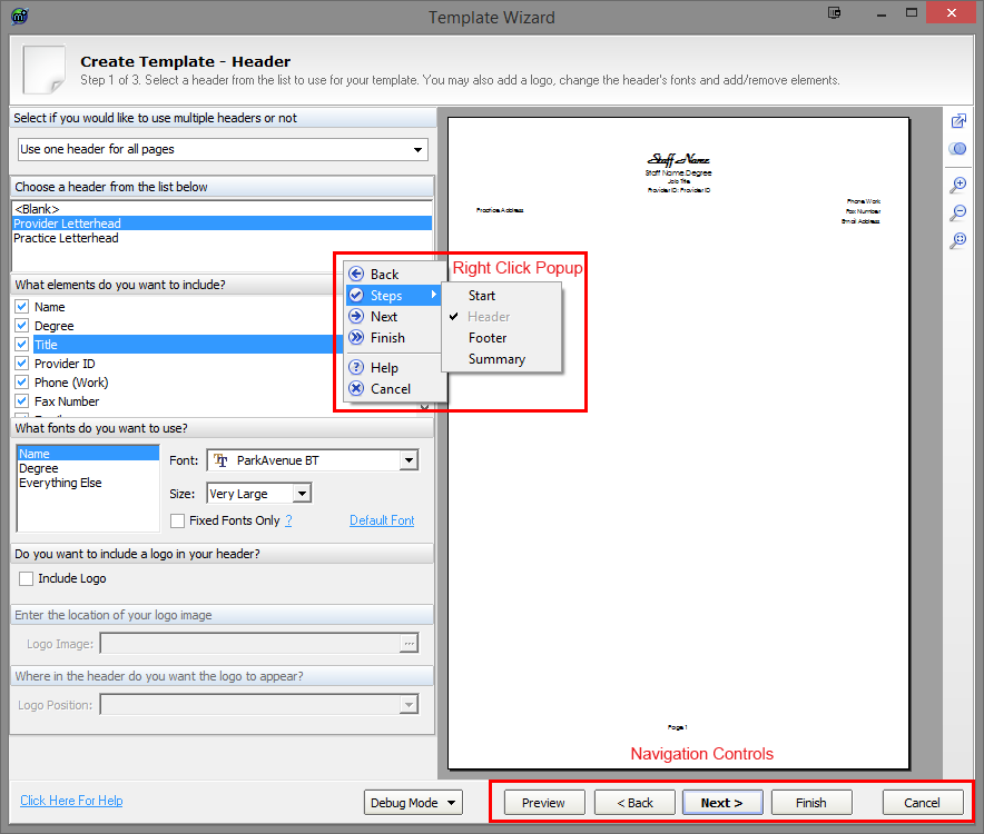
The primary navigation controls are along the bar at the bottom of the template wizard window. The user can also right click anywhere on the top bar, bottom bar or left pane to bring up a navigation popup menu. These controls replicate the controls along the bottom bar, with the addition of the Steps control.
Back
Clicking Back takes the user to the previous step.
Next
Clicking Next takes the user to the next step.
Finish
Clicking Finish takes the user to the final step, which is always the Summary screen. On the Letterhead Template and the Letterhead Template From Word Doc, the user may click Finish at any time, without having to go through each individual step. If the user does do this, default (recommended) properties will be used.
Cancel
The user can also click the Cancel button at any time to close the template wizard.
Steps Menu
The Steps control allows users to navigate to specific steps within the wizard for the type they have chosen.
 Properties
All three template types share some common properties: the template name, the page orientation and the paper size. Additionally, for Letterhead Template and Letterhead Template From Word Doc, there is a property for setting the template as the default letterhead. Please see below for more information regarding these properties.
Template Name
The user must give their template a name, as this is what it will be referred to in the Template Manager and when the user goes to use it. Therefore, it is a good idea to use a short but descriptive and meaningful name.
Page Orientation
Choose whether the template will be a portrait format (the height of the paper is greater than its width) or landscape format (width being the longest side). This property is optional with the default being portrait.
Paper Size
Here the user can choose what paper size the template will be used on. Choosing a paper size is optional with A4 (210x297mm) being the default size.
Set as Default Letterhead
This property allows the user to set the template as the default. What this means is that this particular template will replace the previous default letterhead, and this default letterhead gets used in situations where a specific letterheads is not explicitly selected by the user.
 Previewing
The preview pane and preview controls give the user the opportunity to view how their template will appear as they create and customise it. The preview pane is located to the right of the template wizard window and depicts the page as it will appear. The preview controls are located on the vertical bar on the right of the preview pane, with a Preview button also located along the bottom bar. Right clicking anywhere within the preview pane brings up a popup menu that replicates the preview controls found on the right vertical bar.
Preview
The preview control ( ) opens up a separate preview window of your template that gives you the ability to do things like print and save as RTF. The Preview button along the bottom bar also opens this window.
Show With Merged Data
The Show With Merged Data ( ) / Hide Merged Data (
 ) is a toggle control that allows the user to preview the template with real data inside the merge fields. For example, the merge field Staff Name will change to the logged in user's name (if they have a provider ID) or the name of another staff member. If the field becomes blank, it means that there is no data for that particular merge field (eg. the user might not have a fax number and so any fax number merge fields will display as blank spaces). Clicking the control again removes the merge data from the preview and goes back to only showing the merge field names.
Zoom In
The Zoom In control ( ) allows the user to increase the zoom of the preview pane by 25%, to a maximum of 200%. Left clicking within the preview pane also has the same effect.
Zoom Out
The Zoom Out control ( ) allows users to zoom out of the preview pane by 25%, to a minimum zoom of 25%.
Reset Zoom
The Reset Zoom control ( ) resets the zoom of the preview pane to a size that best fits the current window size of the template wizard.
 Message Template
The message template allows you to create templates with default body content, making it easier to quickly produce common letters and reports in specific layouts. You can include various text stubs called fragments that contain merge fields, allowing convenient access to common letter elements and pre-filled data.
Step 1: Body
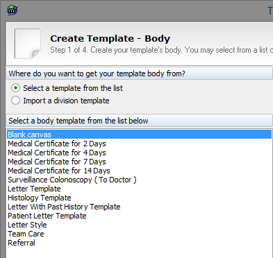
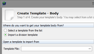
The first step when creating a message template involves selecting a template body. The user has two choices: Select a template from the list and Import a division template. The choice the user makes here affects which path they take within the wizard.
Select a template from the list
There are three additional steps if Select a template from the list is chosen: Step 2: Fragments, Step 3: Attach Header and Step 4: Summary. With this option, a list of body templates appears in the pane below and the user is to select the one they wish to use. If the user chooses to not have a body template, they can select Blank canvas.
Import a division template
For Import a division template, there are two additional steps: Step 3: Attach Header and Step 4: Summary. For this option, the user is required to select a division template by clicking the ellipsis at the end of the Template File box. This opens an Open File dialog which the user can then use to select a RTF file to open.
 Step 2: Fragments
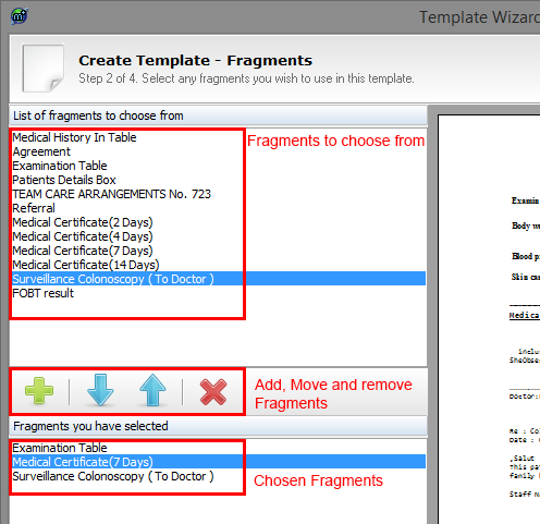
Fragments are blocks of pre-formatted text that contain merge fields and specific layouts. They allow the building of specific message templates, so that commonly and frequently used letters and reports can be quickly and easily created without having to rewrite and format the same text every time. The fragments step consists of three areas: List of fragments to choose from, the Fragment Controls and Fragments you have selected.
List of fragments to choose from
This is the top pane and it consists of a list of all available fragments that can be added to the template. To add a fragment to the template, the user can either double-click the fragment; select it and click the Add button (see below); or drag the fragment from the top pane down to the bottom pane.
Fragment Controls
This is the middle bar and it consists of four buttons:
 This is the Add button. After selecting a fragment from the list above, the user can click this button and it will be added to the template. Added fragments appear in a list at the bottom of the pane and can be removed and moved up and down with the other fragment controls.
 This is the Down button. If the template contains multiple fragments, this moves the selected fragment below the one directly underneath it.
 This is the Up button. It moves a selected fragment above the fragment that is on top of it.
 This is the Delete button. This removes a selected fragment from the template.
Fragments you have selected
This is a list that contains all the fragments that have been selected. They appear in the same order as they will appear in the template, so the user can select certain fragments within this list and use the Up and Down buttons to move their positions. Fragments can also be removed by clicking the Delete button.
 Step 3: Attach Header
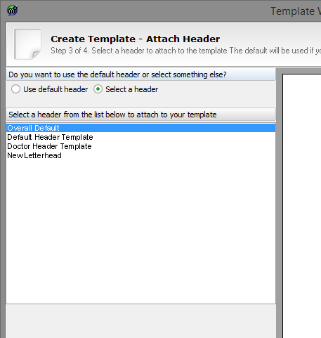
The Attach Header Step allows the user to select a header to be shown on the template. The user can either select the Use default header option, which will use the default header; or the Select a header option, which gives the user the opportunity to select a header of their choosing from the list of headers in the pane below.
 Step 4: Summary
Please see the Summary and Saving section for more information.
 Letterhead Template
The letterhead template allows users to create personalised headers and footers for use in letters and reports within Explorer. The user is able to select which text elements to show (eg. Practice Address, Fax, Number, etc.) and how they appear (ie. font size and style), as well as include logos.
There are three steps involved in creating a letterhead template: the header step, the footer step and the summary step. Please see below for more information about these steps.
 Step 1: Header
Headers are what will appear at the top of letterheads and typically consist of information such as doctors' names, practice addresses, contact numbers and organisation logos.
Multiple Headers
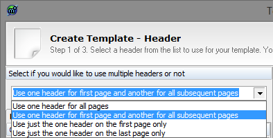
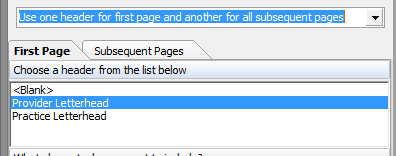
One letterhead template can contain up to two headers. The user is able to use one header for all pages (ie. the header will appear on each and every page in a document) or they can use one header for the first page and then a different header for every other page after that. The latter is usually used in situations where the letterhead is likely to have a cover-letter or no header on the first page but a header and every other page.
Selecting multiple headers causes the pane below to split into two tabs: First Page and Subsequent Pages. The properties below this relate to which of these tabs is selected so that different properties can be chosen for the different headers. Furthermore, choosing multiple headers will cause the preview pane on the left to display two pages: one as a preview of the first page and the second page as a preview for every page after that. If, because of this, the pages are now too small is see properly, either maximise the template wizard window or use the preview zoom controls.
Choosing a header
The next property (Choose a header from the list below) allows the user to select which header style to use for their template. If the user does not wish to use a header, they can select <Blank>.
Elements
Each header is made up of a number of elements, such as Degree, Provider ID and Email. Some elements might be more desirable to have in the letterhead than others, so the user is able to select which elements to include and remove by checking the tick boxes next to each element's name. As a shortcut, users are able to right-click within the element list to bring up a popup menu, which allows them to select or deselect all elements at once. This is particularly useful if a user only wants to show one element from the header but all are selected by default.

Fonts
The fonts properties gives the user the opportunity to change the font and font size of the various elements. To change the font of a particular element or element group (an element group is made up of several loosely related elements), first select it from the list on the left. Once selected, it will be highlighted in a different colour and the controls on the right of this list will only apply specifically to that element or element group.
To change the font of the selected element or element group, use the Font dropdown box on the right to select a new font. Once a new font is selected, the change will be reflected in the preview pane, so the user is able to see how it looks.
To change the font size of the selected element or element group, drop down the Size control and choose whether the size will be Very Small, Small, Normal, Large or Very Large.
Below the Size control, there is a checkbox called Fixed Fonts Only. Checking this will cause only fixed fonts to be chosen from the Fonts dropdown control. A fixed font means that what the user sees on their display is closer to what the customer at the receiving end will see. Specifically, a fixed font, also known as a monospaced font, is a font whose characters all have the same width. Fixed width fonts improve readability and allow tabulation data to be correctly and consistently laid out in plain text viewers and editors.
In the bottom right corner of the fonts section, there is a link called Default Font. Clicking this resets the selected element or element group's font and font size to the original default values.

Logo
A logo can be inserted into a user's letterhead template header. Image files supported by the template wizard include JPEG, BMP, GIF and PNG. It is recommended that logos use white or transparent backgrounds so as to better integrate with the paper, as opposed to having a large block of background colour contrasting with the white of the paper.
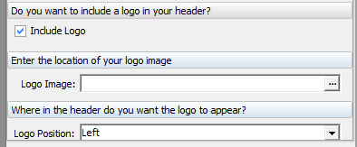
To include a logo image, first tick the Include Logo checkbox. If this control isn't visible or cannot be checked, the currently selected header style doesn't support logos.
The user then needs to click the ellipsis located at the end of the Logo Image. This will show an Open File dialog box that the user needs to use to select an image file.
The user can also change where in the header the logo will appear by using the dropdown box called Logo Position to select a position.
Please note that the template wizard attempts to make the chosen image fit with the rest of the header and will therefore sometimes shrink and/or manipulate the image so that it appears correctly. If the user's chosen image dimensions look incorrect in the template, it is recommended that the user resize the image manually in image editing software before selecting it to use. Furthermore, if the image doesn't appear, or appears blocky, discoloured, or is supposed to be transparent but isn't, it is possible that the image used has incorrect headers, poorly-formed image data, uses unrecognised compression methods or is an obscure and/or unsupported image type. In this event, it is recommended that the image be changed or saved in a different format using image editing software.
 Step 2: Footer
As everything with the footer is essentially identical to the way the header gets configured, please see Step 1: Header above for further information.
 Step 3: Summary
Please see the Summary and Saving section for more information.
 Letterhead Template From Word Doc
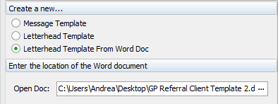
Letterhead Template from Word Doc allows users to import the headers and footers from Microsoft Word Documents (.doc and .docx) to use as their letterhead templates in Explorer.
There is only on step and only one additional property. To import the header and footer from a Word Document, first click the ellipsis at the right end of the Open Doc text box. This will show an Open File dialog box. From here, the user can locate and select the .doc or .docx document they wish to use and click the Open button. The document's header and footer should now show in the preview pane. If it doesn't show, the Word Document either doesn't have a proper header and/or footer, or it is in an unconventional format (in which case, it would be best to recreate the header/footer manually using Explorer's Word Processor).
Please note that if a user attempts to move away from this step (ie. click Next or Finish) without first selecting a valid Word Document, the Open Doc area will turn a shade of red and the wizard will prompt the user to select a document.
 Summary and Saving
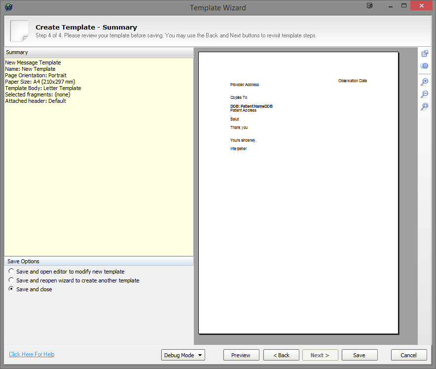
The summary step is the final step for all template types and it gives the user the opportunity to review the properties of their new template that they have selected. Users can navigate to previous steps to make any changes by using the Back button.
On the summary window, the Finish button is replaced with a Save button. Once a user is happy with their template, they can click this Save button to save their template.
There are three save options on the summary window and these are located below the summary pane.
Save and open editor to modify new template
Once a user has clicked the Save button, the newly created template is opened in Explorer's word processor. This is the default option and allows the user to fine tune and make manual changes to their template.
Save and reopen wizard to create another template
After the user's template is saved, the template wizard is reopened so that the user can create additional templates.
Save and close
When a user saves their template, the template wizard is closed and the user is returned to the Template Manager.
Help
For further help or guidance in using the template wizard, please contact the Medical-Objects helpdesk on (07) 5456 6000.